Logos Round Corner | Be Solar
Round Corner and Be Solar are two engineering studios of the same entrepreneur, Nacho Eguía, product design engineer, who uses the Round Corner brand to offer his services as a designer of car parts and other products, and the Be brand Solar to offer engineering services in the field of renewable energy, more specifically solar energy.
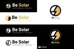
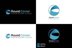
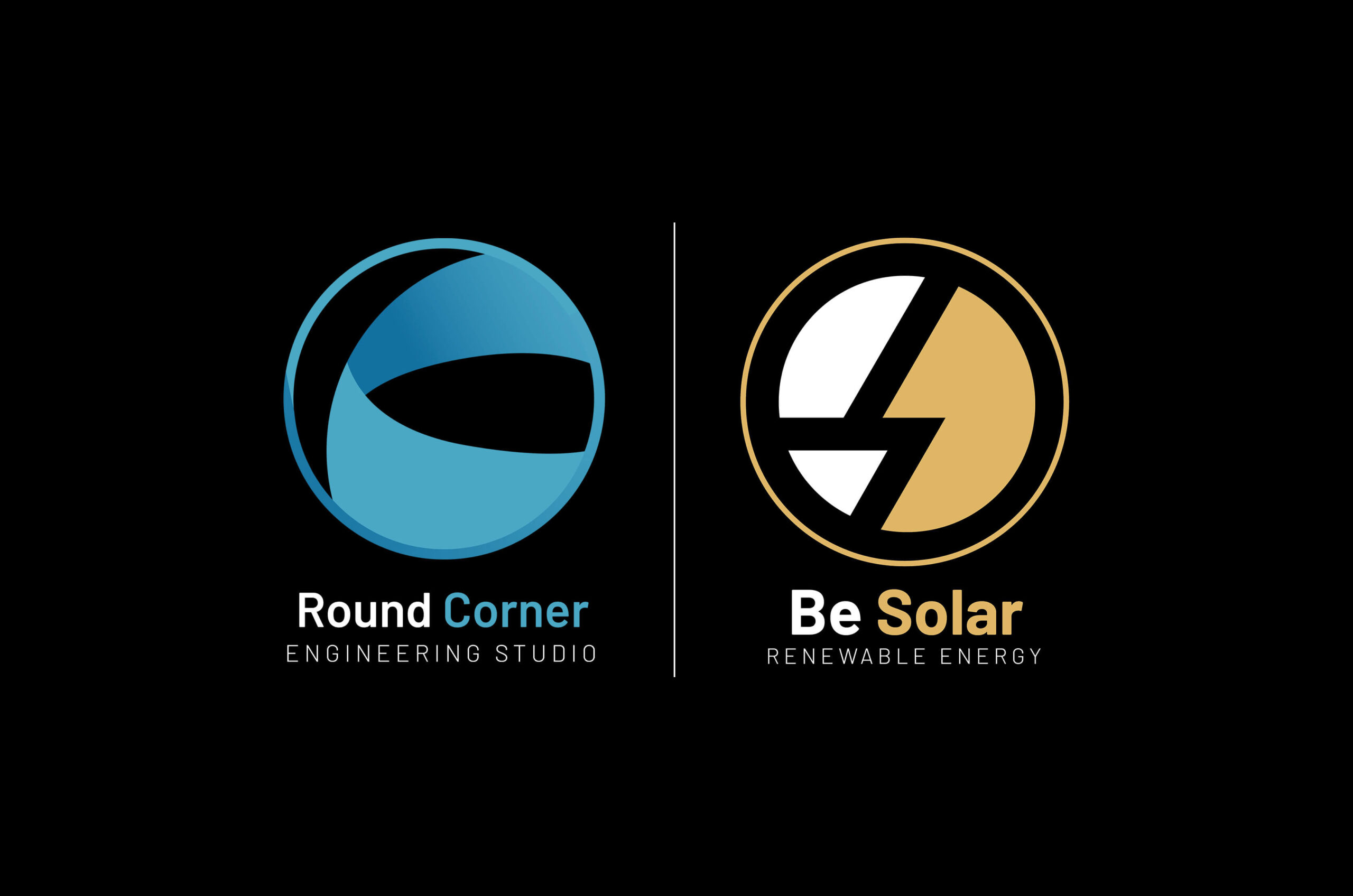
In both logos, an attempt has been made to use shapes that show the core of the company, in the case of Round Corner, the angle of a figure that never ends, in the case of Be Solar, a ray in the middle that however it forms the B and S of Be and Solar.
The same sober and elegant typography has been used for both logos, and a circle to contain the isotype, in order to show continuity between them and show that they are part of the same group. In terms of colors, the yellow of Be Solar clearly refers to the sun, and the blue of Round Corner shows the perception of space and is synonymous with freshness.
- Client
- Round Corner | Be Solar
- Release Date
- October 2022


